CLIENT
Red Bean – fictitious company
YEAR
2026
PROJECT SCOPE
Visual Identity
Red bean
Red Bean is a fictitious new specialty coffee shop preparing to open in Copenhagen. The shop specializes in filter coffee and selling ethically sourced coffee beans from producers across different parts of the world.
Red Bean needs a visual identity that can establish a distinctive presence in a competitive specialty-coffee market. Because the brand will feature beans from different origins, the identity needs to be flexible enough to accommodate changing coffees and stories without becoming visually inconsistent.
CHEERFUL · ENERGETIC · SUSTAINABLE
Logo
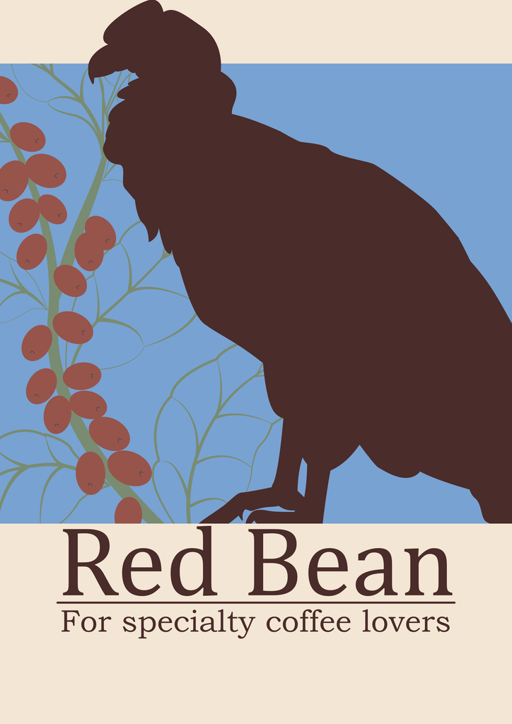
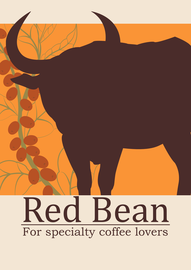
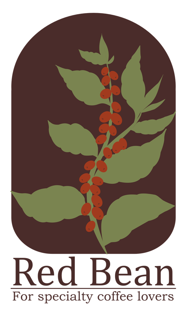
The logo consists of a coffee plant branch with red coffee beans, framed within a chocolate brown arch, and the company name “Red Bean” and the tagline “For specialty coffee lovers”.
The coffee plant branch connects the brand to coffee at its source, while the red coffee beans reflect the company’s name. The color of the background was chosen to be chocolate brown as it resembles the color of a freshly brewed cup of coffee.
The presence of the company’s name in the logo helps with recognizability, while the tagline communicates the brand’s focus on specialty coffee.
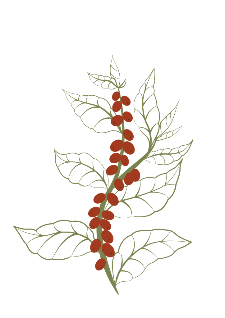
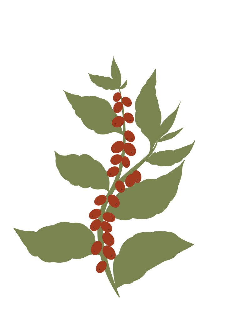
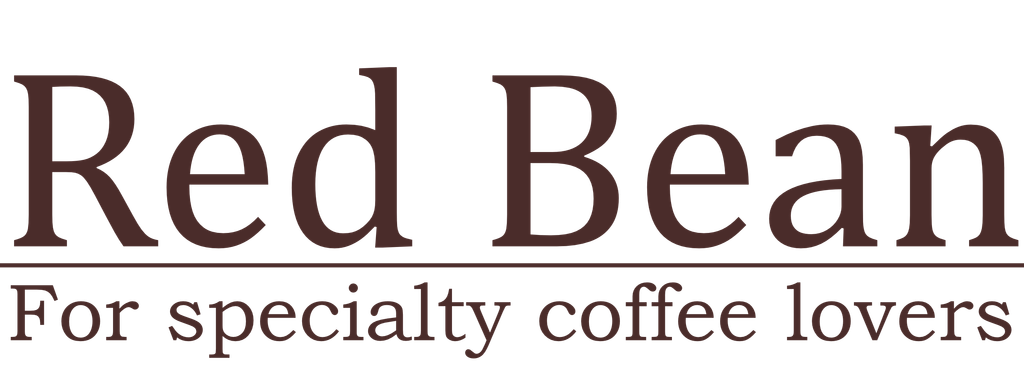
wordmark
The company name and tagline can be used as a separate unit from the main logo as a wordmark.
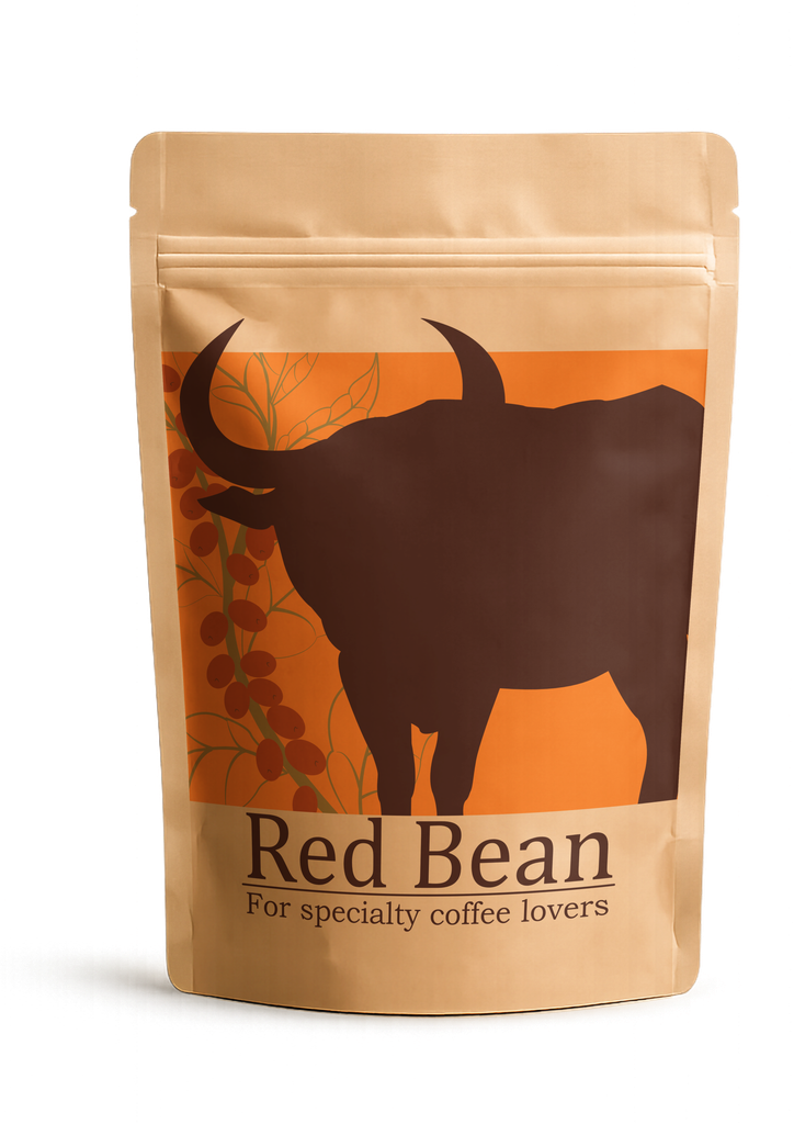
This modular approach allows for a consistent visual presence while adapting the identity to different applications such as packaging, signage, digital content and smaller-scale placements.
Typography
Logo type
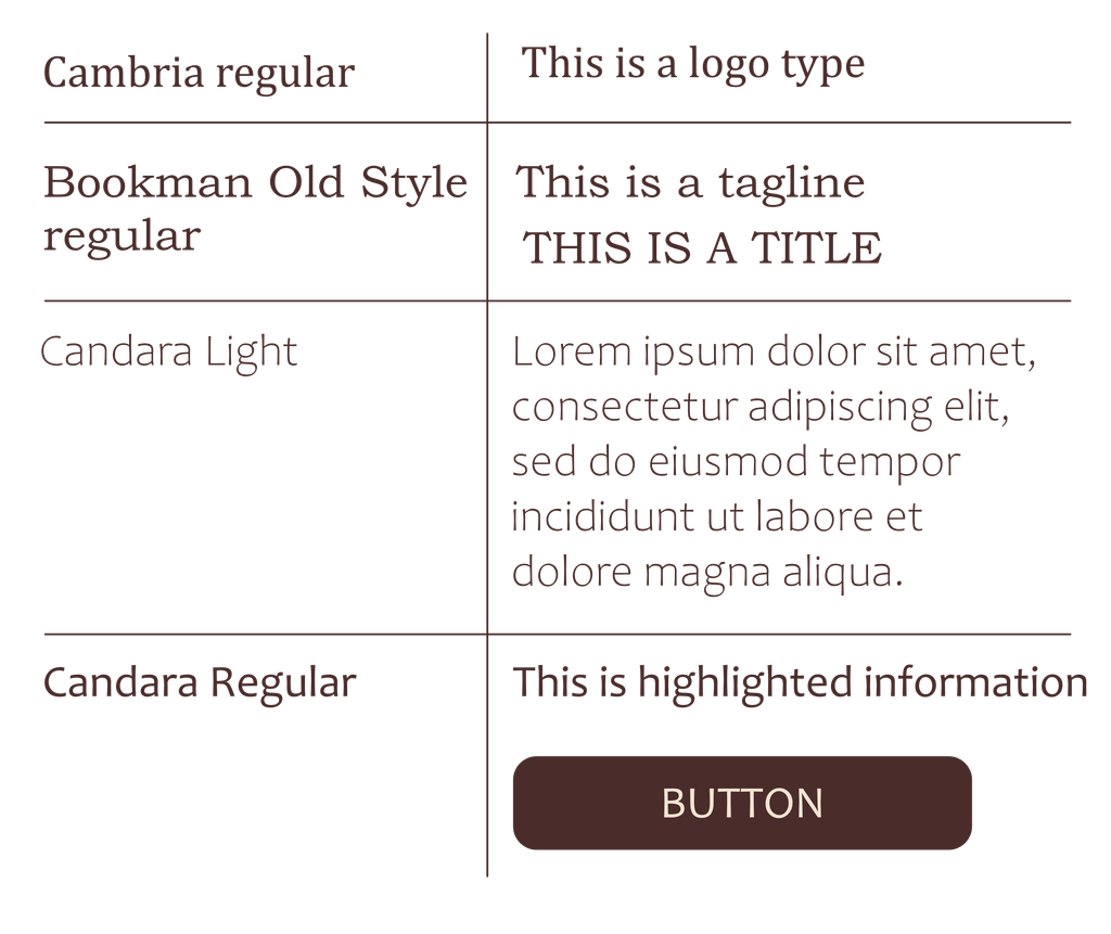
Cambria regular was used as a typeface for the company’s name “Red Bean” in the logo and wordmark. This font was selected based on its serif structure and balanced proportions. The moderate contrast between thick and thin strokes adds character while keeping the lettering clear and approachable.
Titles/Taglines
Bookman Old Style regular is used for taglines and titles. It has a serif structure, but it contrasts the structured appearance of Cambria through its rounded letterforms that add warmth and approachability to the typography.
To distinguish between the two, taglines start with a capital letter and continue in lower case, while titles are fully written with capital letters.
Body text
Candara is a sans-serif font that is used for body text and UI elements. It’s a simple typeface that slightly resembles Bookman Old Style in the roundness of the letterforms.
Candara Light is used for general body text, while Candara Regular is used to highlight important information and for UI elements such as buttons.
color palette
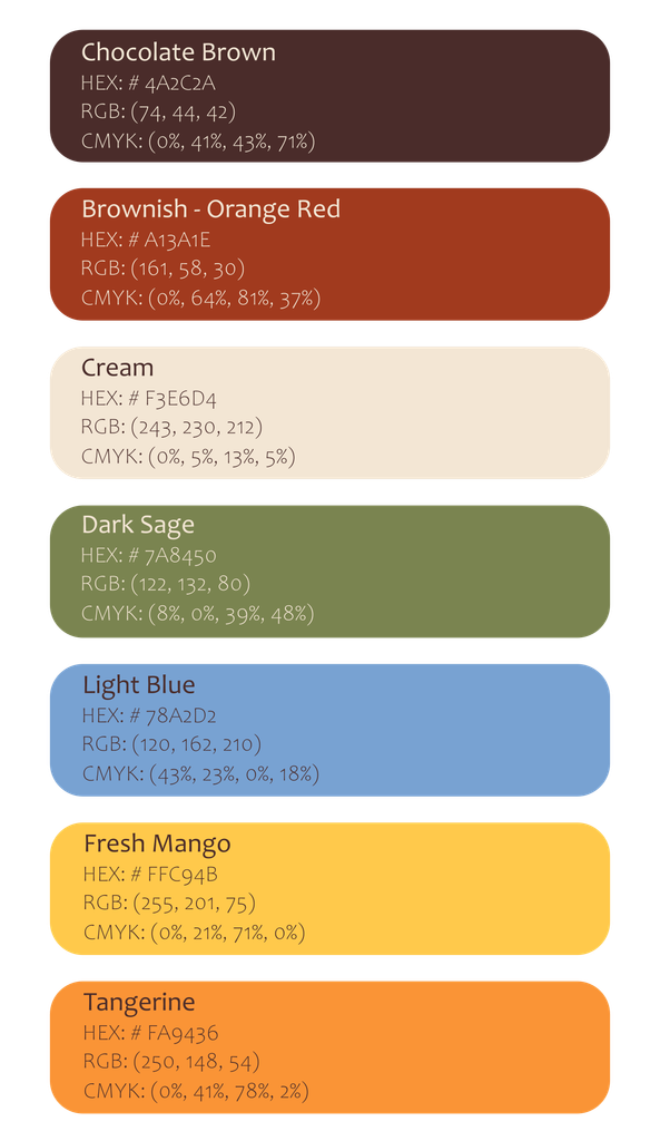
The color palette combines organic colors with fun, energetic colors.
The primary colors are : “Chocolate Brown” (HEX: #4A2C2A) and “Cream” (HEX: #F3E6D4).
These are the main colors used across branding in order to maintain a consistent visual identity.
“Chocolate brown” is used as a logotype color, as well as the background of the arch present in the logo, as a text color, section backgrounds, and graphic elements.
“Cream” is used as a background color, a text color in case of a dark background, and icon color.
The secondary colors are: “Brownish-Orange Red” (HEX: #A13A1E) and “Dark Sage” (HEX: #7A8450).
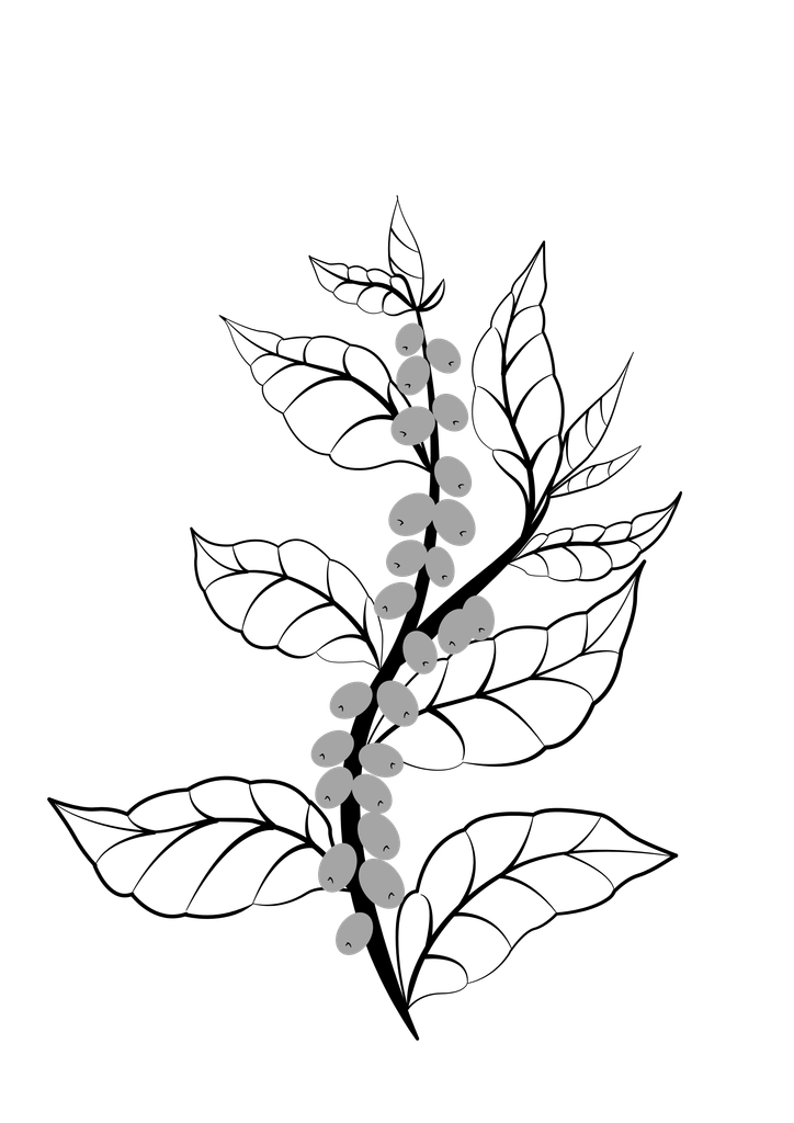
These colors are used mainly in the logo for the red coffee beans and coffee plant branch respectively. However, they appear in some graphics through an iteration of the coffee plant branch, and icons.
Even though they don’t appear as much, these colors are regarded as secondary due to the important role they play for the brand’s recognizability through their presence in the logo.
The accent colors are: “Fresh Mango” (HEX: #FFC94B), “Light Blue” (HEX: #78A2D2), and “Tangerine” (HEX: #FFC94B).
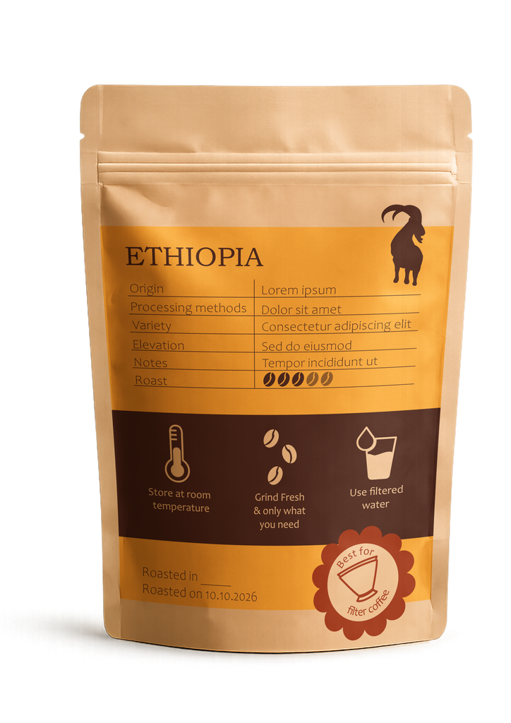
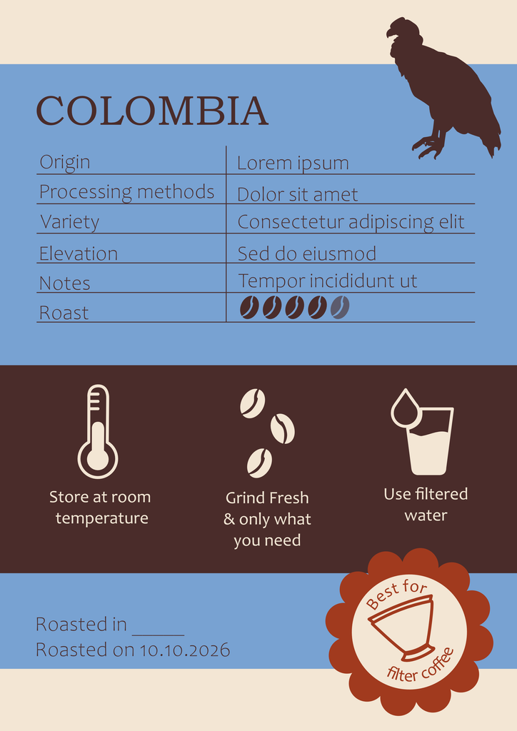
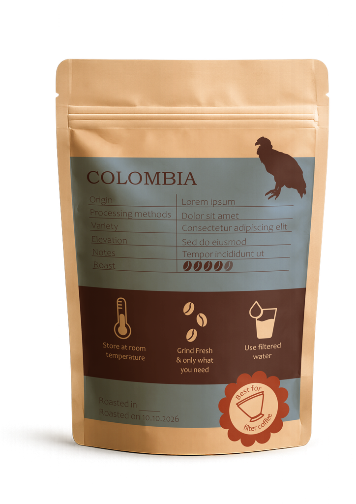
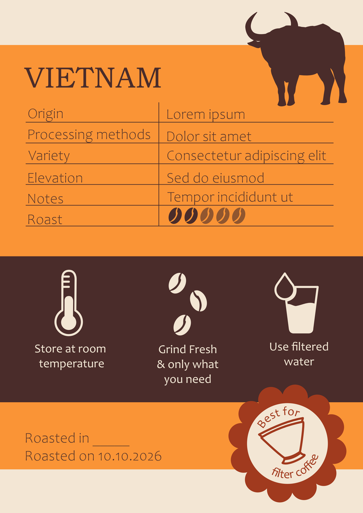
Each of these three colors is used to represent a different coffee origin. They appear in the graphics for the coffee packaging and potential materials used to promote coffee from that same origin.
They are bright, as they are meant to feel energetic, fun, and attention grabbing.
Graphics
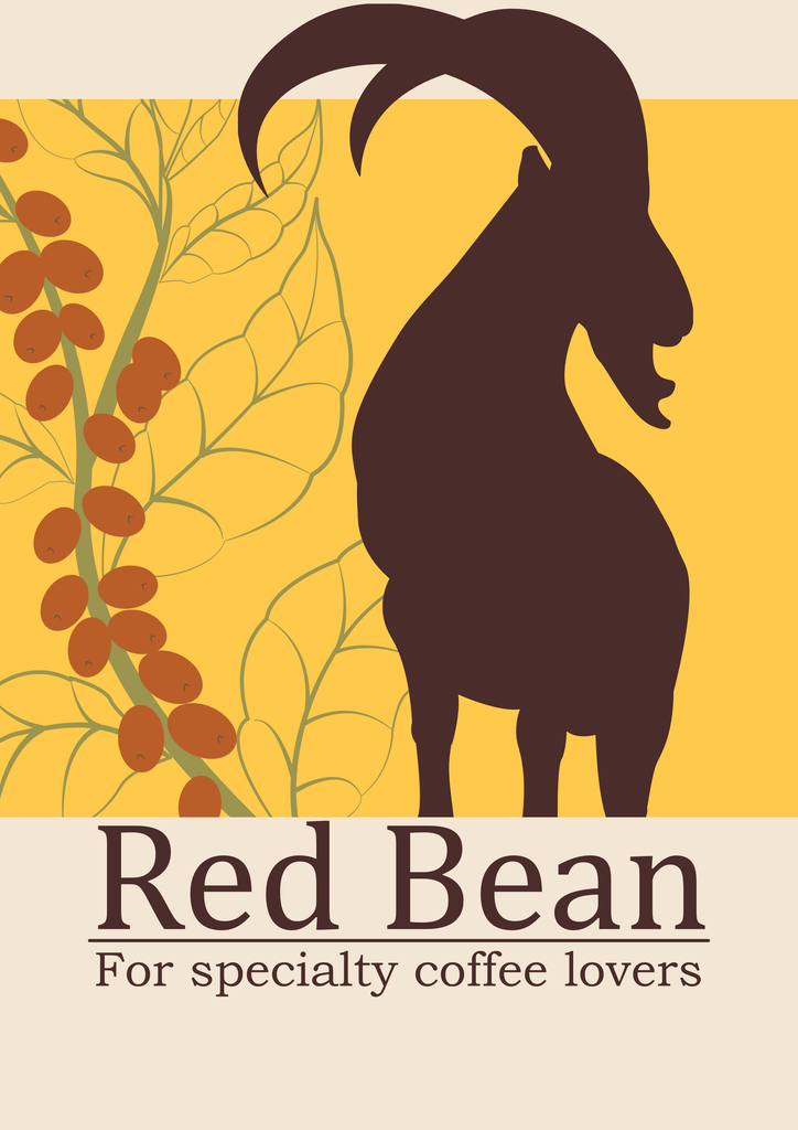
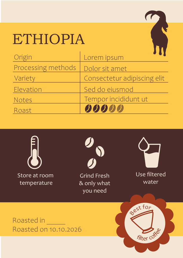
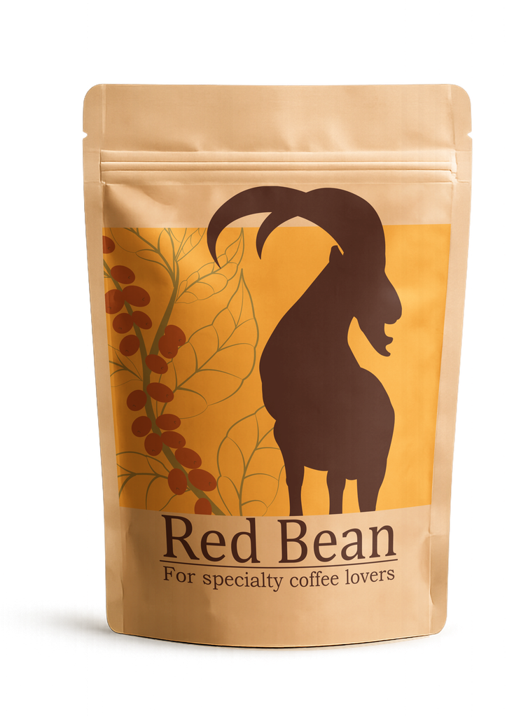
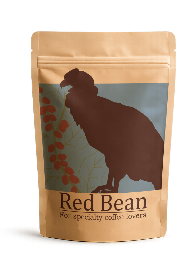
This section will focus mainly on the graphics for the packaging.
To start with, Red Bean offers coffee from 3 different countries
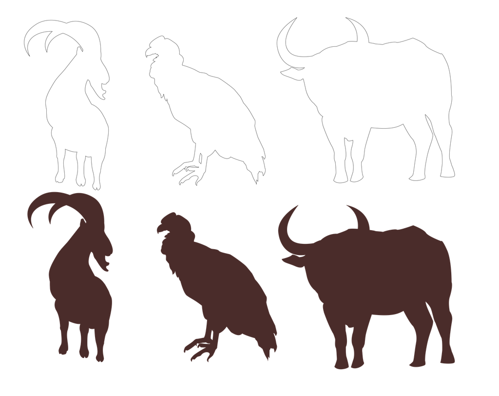
( Ethiopia, Colombia, and Vietnam). In order to show the coffee’s different origins through more than just color, silhouettes of each country’s national animal were created.
Ethiopia = Walia ibex
Colombia = Andean Condor
Vietnam = Water Buffalo
The background colors are different for each coffee origin. However, the coffee branch and the “Chocolate Brown” color of the animal silhouettes create visual consistency across all three designs.